Summary
During Summer 2019, I worked with the Center for Academic Innovation at University of Michigan (UM) - Ann Arbor as a User Experience Research Fellow to shape the future of UM's online learning experience. Here, with an enthusiastic fellow researcher and a manager, I brainstormed, assessed impact, and explored opportunities to improve the user experience of online learning tools using qualitative research methods. Depending on the stage of development the tools were in, we would either perform pre-design or post-design analyses. We conducted 16 usability studies (in-person hallway tests and remote tests), 7 detailed interviews and analysed 2000+ survey feedback (open responses) to uncover unmet user needs across 8 products. We further pinpointed solution spaces with corresponding interaction maps and heuristic evaluations. I also facilitated a generative workshop, led card sorting exercises and worked on internal process improvement projects. Here, I showcase selected work from a couple of products.
At the end of 3 months, the team had a solid set of features, evolved from thorough user research, that they could confidently pursue in their development pipeline for the next 2 quarters.
Team
1 Graduate UX Research Fellow (me), 1 Undergraduate UX Research Fellow, 1 Product Portfolio Manager
Tools
Google Suite (Gmail, Docs, Sheets, Slides), Airtable, Trello, Slack, Mobile Phone (camera and mic), Sticky notes
My Role
+ Identify opportunities for usability testing and user experience research
+ Find right research method for the opportunity
+ Plan, schedule and execute research
+ Develop protocols, synthesis frameworks and summaries
+ Create and constantly update library of research methods and user archetypes
+ Supervise, mentor and coach undergraduate UX Researcher and UX Designer fellows
UX Research Process Map. Most projects took between 1-2 weeks. We were always working on 2 to 3 projects simultaneously during the week. These would be a combination of post-design project that needed individual focus work and pre-design projects that needed a lot of collaboration.
Problem Roulette is a tool to help students study by practicing questions from previous exams. Students can select topics and work their way through a randomized set of problems. Problem Roulette also has a Group Study Mode feature where students can invite their friends through email, and then multiple students can work on the same set of problems together.
Challenge 1
The team of UX Designers working on this product wanted us to test their hypotheses about push notifications, performance dashboard and new features.
Solution
A set of quick hallway interviews to gauge students' reaction to various hypotheses.
Research Questions
1. How do students want to learn about new features?
2. Is the dashboard useful and intuitive to students?
3. How do students want to be delivered content and specific question sets?
4. How/where do students prefer to get notifications?
2. Is the dashboard useful and intuitive to students?
3. How do students want to be delivered content and specific question sets?
4. How/where do students prefer to get notifications?
Method
We just showed up with our laptops at various locations and asked people if they had used Problem Roulette. If they responded yes, we proceeded to ask the questions from our protocol which would take around 10-15 minutes. We had 7 participants. This was planned, executed and summarized in 3 days and gave the designers very clear direction on students' preferences.
For this exercise, I partnered with another UX research fellow. We had a Google Sheet with note-taking framework with questions ready to go. We would take turns interviewing and taking notes. Once we were done with all the interviews, we combed through the notes to identify the most common themes and feature requests.
Key Findings
1. Students generally like something that catches their attention, but is also optional. Example, pop-up tutorials that can be skipped, notification that doesn't get "marked as read" until they have gone through the tutorial or explanation page.
2. Students were not aware that they could access the saved problems from the dashboard, as they never looked carefully here. Periodic notifications about the topics they are doing well in, topics they are lagging in, exam countdown and reminder about saved questions could push users to navigate to the dashboard.
3. Students want 1 set of questions pushed per week. This could be a set related to the topics covered during the week or from topics that are scheduled to be tested in an upcoming exam or quiz.
4. Students want flexibility and the option to choose when and where they are notified (in-app, e-mails, desktop)
Feature Requests
+ Exam countdown.
+ Suggestions/Reminders to start studying for specific exams.
+ List of sessions and exams taken on the dashboard.
+ Ability to go back to a session where I left it from dashboard.
+ Graph showing accuracy in exams.
+ An "Expected Score" based on my accuracy in topics for a subject/course.
+ Suggestions/Reminders to start studying for specific exams.
+ List of sessions and exams taken on the dashboard.
+ Ability to go back to a session where I left it from dashboard.
+ Graph showing accuracy in exams.
+ An "Expected Score" based on my accuracy in topics for a subject/course.
Challenge 2
Problem Roulette's Group Study Mode was in its first year of being on the live website. As the software team prepared to head into their next development cycle, they were hoping to gather user feedback in order to plan for Group Study Mode 2.0.
Solution
A facilitated workshop with design thinking exercises to evolve generative ideas.
Method
We realized that we had a great resource in the office: all of the summer interns. We often found ourselves doing hallway testing or asking the interns for their input on things, and because our target population was students, this was a perfect opportunity.
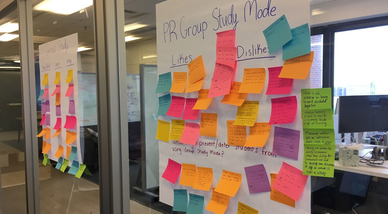
We invited 10 Summer Fellows from different graduate and undergraduate programs to join us for the workshop, where we went through a Group Study Mode session together. I logged in to the session and invited everyone, and then as we progressed through the session, we asked the fellows to write down their feedback and observations on sticky notes.
We also wrote prompts on three large sheets that we hung on the conference room walls. Once we completed the study session, we had a discussion that focused on the fellows' group study preferences, their likes, dislikes, and suggestions about the current Group Study Mode format, and their thoughts on how to make the tool more engaging. As we went around the table during the discussion, we also asked each person to place their sticky notes under appropriate prompts on the sheet.
This exercise was planned, executed and summarized within a week.


Analysis
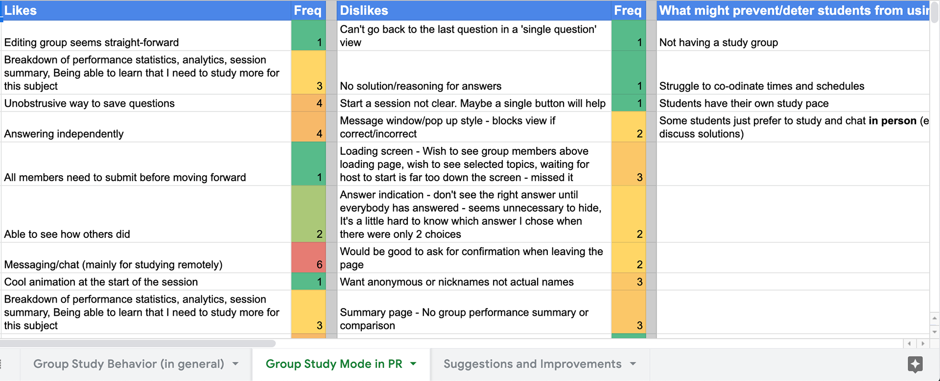
Following the workshop, my UX Research partner and I used affinity mapping to further categorize the feedback. After grouping together common suggestions, we listed how many notes corresponded to each theme to help emphasize the significance of the suggestions.
To clearly show the number of notes per theme, we documented the sticky notes in a Google Sheet. From this sheet, we pulled the most-noted themes and shared them with the Problem Roulette team as our biggest takeaways. We also shared this spreadsheet with the team.


Key Findings
1. The participants disliked having to study/do questions simultaneously and wait to proceed. One suggestion is to allow students to work through a set number of questions at their own pace, and then wait at the end to see the correct/wrong questions across the group. (8 notes)
2. Participants liked the chat feature (6 notes)
3. Improving Engagement through Discussion - Encouraging discussion, either through additional prompts (options for wanting discussion/no discussion quick quiz mode) or through making the chat a more prominent and embedded part of the page "don't hide chat, make it clear and visible so it doesn't block things and also has everyone see it" "noting which questions were being answered when in the chat might be helpful" (5 notes)
4. Suggestion of having "open groups" to join - similar to a game server, allow students to randomly join groups with other students who are online (5 notes)
Atlas displays historic data about the U-M curriculum to guide U-M students, instructors, and staff in decision-making. Atlas had just undergone re-branding exercise and had a completely new avatar.
Challenge 1
The designers wanted to quickly gauge students' reaction to the new branding and redesigned website.
Solution
Guerilla testing
Research questions/goals
1. To quickly gauge the perception of students about the redesigned Atlas (previously ART) course page and get some overall feedback on the redesign about first impressions, general feelings, things that particularly stand out.
2. What do students value most/what are they drawn to look at?
3. Are there things from the old design that are missing that were working well?
Method
We went out to the Cafe and Lounge area in the Library at 11:00 am. We managed to interview 5 students from different years of undergraduate studies and different majors. We would start by asking them if they had 10 minutes to spare to give us feedback about a tool that would help them plan their semester. If they said yes, we would open up the Atlas site, ask them to navigate and search a course they are looking to take in Fall term and ask the questions from our protocol as they look through the course page.
Key Findings
1. All participants felt that the page was organized, comprehensive, easy to navigate and understand, clear and informative.
2. We noticed that students generally scrolled down till the end of the page and even went back to check a few items again. This signaled that there was a good mix of visual elements, graphs and charts that keep the students engaged with relevant information throughout the page.
3. While freshman looked at course evaluations, the others focused more on the course pathways, grades and student enrollment.
4. One participant opened a course with a lot of prerequisites, the first card with course summary was so large that it occupied the whole screen and most of it was empty with see more option for course description and just the advisory prerequisites listed on the right side. This created a confusion about the page having loaded completely. The participant was not sure if she could scroll and just waited for quite some time before asking this out loud.
5. All the participants felt comfortable looking at and reading the graphs, visuals and data presented.
6. Some swag ideas suggested by the participants for ATLAS re-branding include reusable folding straws, mugs, water bottles, pens and stickers.
7. One participant mentioned that they would like to know about the exam structure and when during the term does the workload peak.
Challenge 2
Parts of the website with data visualizations are not holding user attention (inference from Google Analytics). Dig deeper into the data visualization graphics and provide insights on how these can be improved.
Solution
Heuristic Evaluation for data visualization graphics (2 hour exercise)
Method
Using the Data Visualization Heuristic Checklist that was adapted from Dr. Stephanie Evergreen and Ann K. Emery, we analyzed the text, arrangement, color and lines based on given guidelines of data visualizations on a single Course Profile page on Atlas. Specifically, we looked at the page for the course STATS 250. Myself and 2 other colleagues went through the page individually and each gave rated the graphics against each guideline within the checklist. Then, we averaged our scores and calculated percentages by dividing the category score by the total points possible for that category. If the percentage was between 90-100%, then that category was considered okay. If the percentage was lower, then we further evaluated our individual responses and have provided takeaways in the next section.
Sample evaluation. Check out the complete evaluation here
Key Findings
1. Color: The Enrollment graph may be hard to differentiate in black and white. To make sure that the graph is legible for people with colorblindness, it would also be good to reconsider the colors for the Enrollment graph because of its current use of red-green and yellow-blue color combinations. The background color of the Course Evaluations data percentage bar is very light, which can make it hard to differentiate from the background of the page.
2. Lines: The tick marks on the letter grade axis of the Grade Distribution graph are not that visually helpful. The Enrollment graph has gridlines while the Grade Distribution graph does not, so it would be good to be consistent in using/not using them.
3. Text: The Course Evaluation data number (ex. 32% of respondents...) is separated from the percentage bar by the title and the image; maybe the title and image could go above the bar so that the percentage is more clearly linked to the percentage bar. Also, most titles are less than 6 words. It's recommended that titles be short descriptions of approximately 6-12 words. The titles could be more descriptive about where the data comes from and how to use this data. Could be useful to move some verbiage from subtitles into the titles like - Percentage students receiving each grade over last 5 years.
Challenge 3
Are there other products in the market tackling similar issues as found in the above research?
Solution
Comparative analysis (2 hours)
Research Goals/Questions
How do other platforms with similar functions (class and meeting schedulers, calendars) allow users to schedule?
How do these platforms present the schedules? What are the various features associated with scheduled events?
Do other products have social features associated with each event like the ability to share calendars and free times, invite people and respond to events?
Method
We listed down a few competing platforms that have diverse scheduling abilities and associated features. These platforms fell under the categories - direct, indirect, partial, parallel and analogous. We then listed down all the features as comparators and marked yes(y), no(n) or to some extent against each platform which can be found in the spreadsheet with raw feedback.
Key Findings
1. Wolverine Access Schedule Builder
Most features from wolverine access' backpacking and scheduling are very comprehensive and necessary (though not very easy to use as a lot of these are hidden and one needs to have read the features page/'how to schedule' page to actually know about them). These can serve as a starting point to design the Scheduler for ART. These features include:
+ Ability to search, select and register for courses.
+ Daily/weekly/monthly schedule views.
+ Detection and notification of schedule conflicts.
+ Ability to add breaks and work hours.
+ Automatically generate alternate schedules based on class times offered and requirements.
+Ability to save and favorite schedules until a final decision is made for the term (until drop/add deadline).
+ Track closed and wait-listed classes.
2. Coursicle
Coursicle is a platform that a huge percentage of students use as an alternative to wolverine access' scheduler. The main additional features that this platform offers are:
+ Notifications about closed classes being opened or moving up in the wait-list.
+ Ability to link up with Facebook to see and share friends' schedules.
+ Ability to let others know your availability for a meeting/study session.
+ Ability to link up with Facebook to see and share friends' schedules.
+ Ability to let others know your availability for a meeting/study session.
3. Other similar platforms (Google Calendar, Calendly et al)
Other features that seem to be popular on similar platforms are:
+ Ability to set reminders.
+ Ability to add notes and attach documents to individual events.
+ Create, view and share multiple calendars.
+ Ability to add notes and attach documents to individual events.
+ Create, view and share multiple calendars.
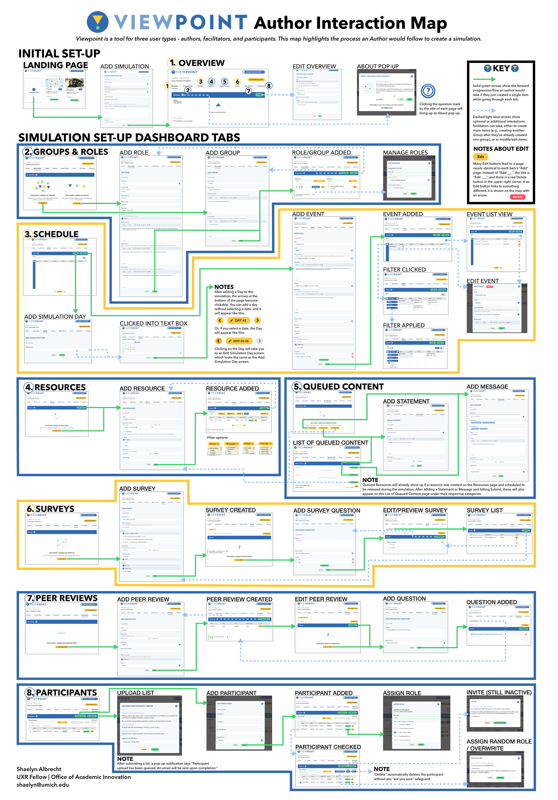
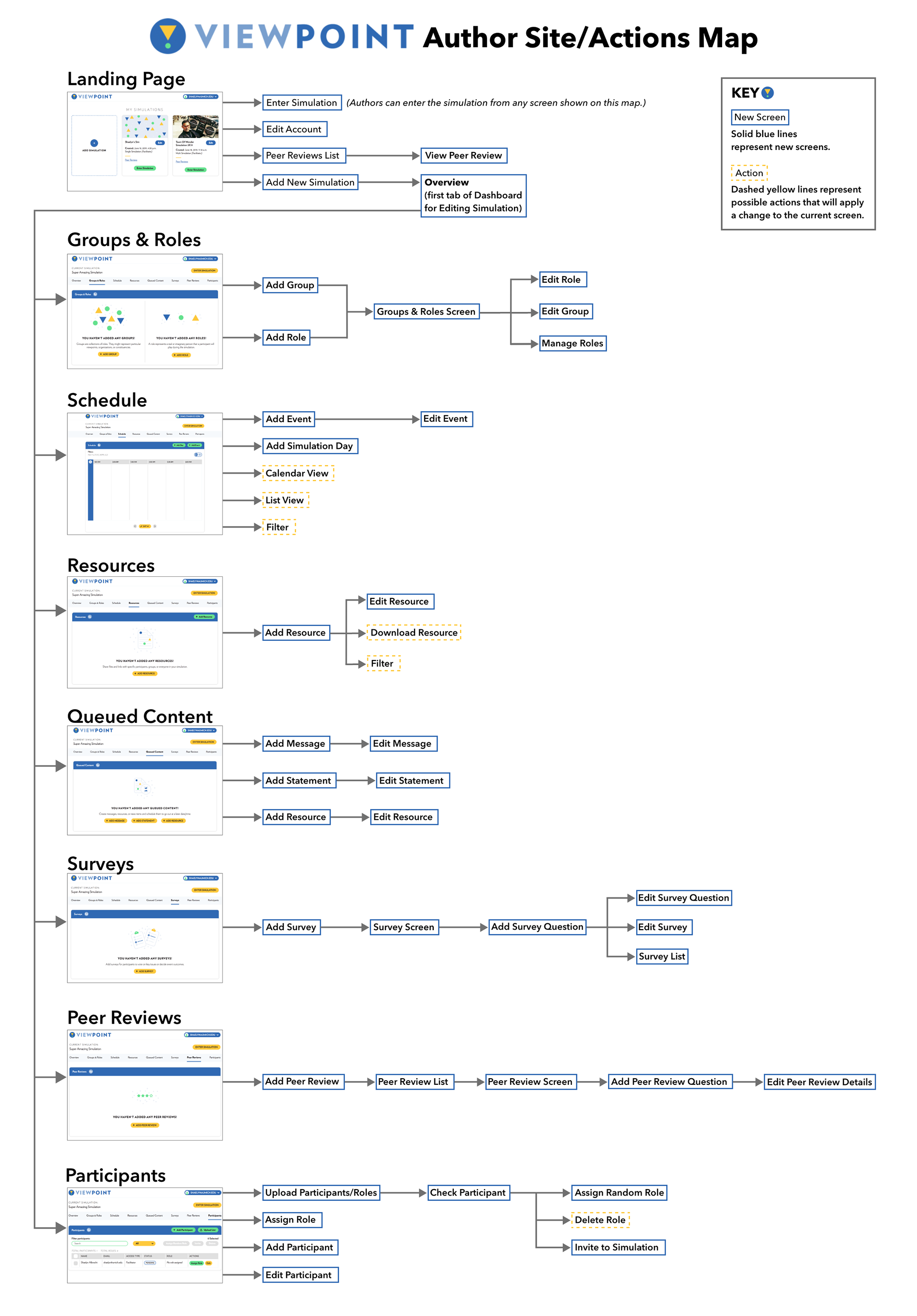
We also developed detailed interaction maps of a couple of tools to understand the user flows, design tests and pinpoint solution spots.


Outcomes and Impact
All of these rapid research sprints cumulatively helped build a backlog of desired features and use cases for 8 different online learning tools which were then prioritized and incorporated into the development cycles for the next 2 quarters.
Reflection
Team work - In such super-fast, agile environments, working in lock-step with a team is extremely important and indispensable. Most research activities need us to work in teams, be it brainstorming methods, note-taking or facilitating. It is extremely important to establish frameworks at the beginning of projects to stay aligned and execute methods efficiently. Moreover, even when we are working in a whirlwind, its important to stop and take time to convene, discuss and summarize work done at consistent check-points along the project to ensure that we are making progress and heading in the right direction.
Here's what the team lead had to say about my work:
Abhishek was a delight to work with. From his first interview, I was impressed with his vision and his interest in users. Something that stands out to me about him is how deeply he cares about the quality and impact of his work. He was eager to jump into projects that were undefined and challenging, and in those projects he worked to establish organization and process. Among his many valuable contributions, Abhishek helped facilitate a human-centered design workshop for one of our software tools and synthesized the results, giving our team valuable insights about pathways to explore for future development. He also led card-sorting exercises that helped us to transform the way that our team organized files in the cloud. Abhishek is a sharp and talented individual who has a lot to offer any team he joins!
- David Nesbitt, Software Portfolio Manager, UM Center for Academic Innovation


